Welcome to the Battle of Olympus Dev Diary, a series dedicated to giving the community a behind-the-scenes look into the process of creating a game from the perspective of the game developers.
In Dev Diary #5, you’ll hear all about the details, whether big or small, about what we’ve been building.
- Animations
- New Move: Grab & Throw
- Effects
- Character & weapon outline
- User interface (UI) for player-versus-player (PvP)
- Coming up next…
Animations
Battle of Olympus has come a long, long way. With the steady stream of updates and asset releases, you may have forgotten where we started. Here’s a reminder for some perspective.
Quite a throwback. But then it was like:
And here we are now:
We’ve come quite a long way, huh?
New Move: Grab & Throw
We’ve been tinkering with PvP for a while now and we are just about ready. All the minor kinks and polishes aside, we felt like there was something missing from our initial roster of mechanics and moves.
Then someone came up with a grab move and there was a collective slap on the forehead. Of course! The classic up-close grab. We’ve quickly remedied this.
Then we added another one, just for good measure.
Obviously, it will look different depending on the weapon a player uses. With the hammer, if the opponent ends up too close to you without a good plan, you can hook them and toss them around like they are nothing.
The grab attack is a simple-to-execute move that cannot be blocked. We designed it so that its primary use is against opponents who heavily rely on blocking, or even refuse to fight altogether, allowing you to break the stalemate and keep the match going. You can also use it in other sticky situations where you end up very close to your opponent.
Effects
While we can now safely say we have most, if not all, of the mechanics down, the job of polishing Battle of Olympus never ends. Here are some brand-new hit effects that will be implemented in the next demo update!
And this one:
The tricky part was to walk the fine line between the cool and epic effects splashing all over the place and a clean visual presentation that allows for a fair competitive environment. We think the animators nailed this one.
Character & weapon outline
One of the first quality-of-life updates. After countless hours spent testing the new moves and effects, we found a simple solution to make the player experience we mentioned above even better.
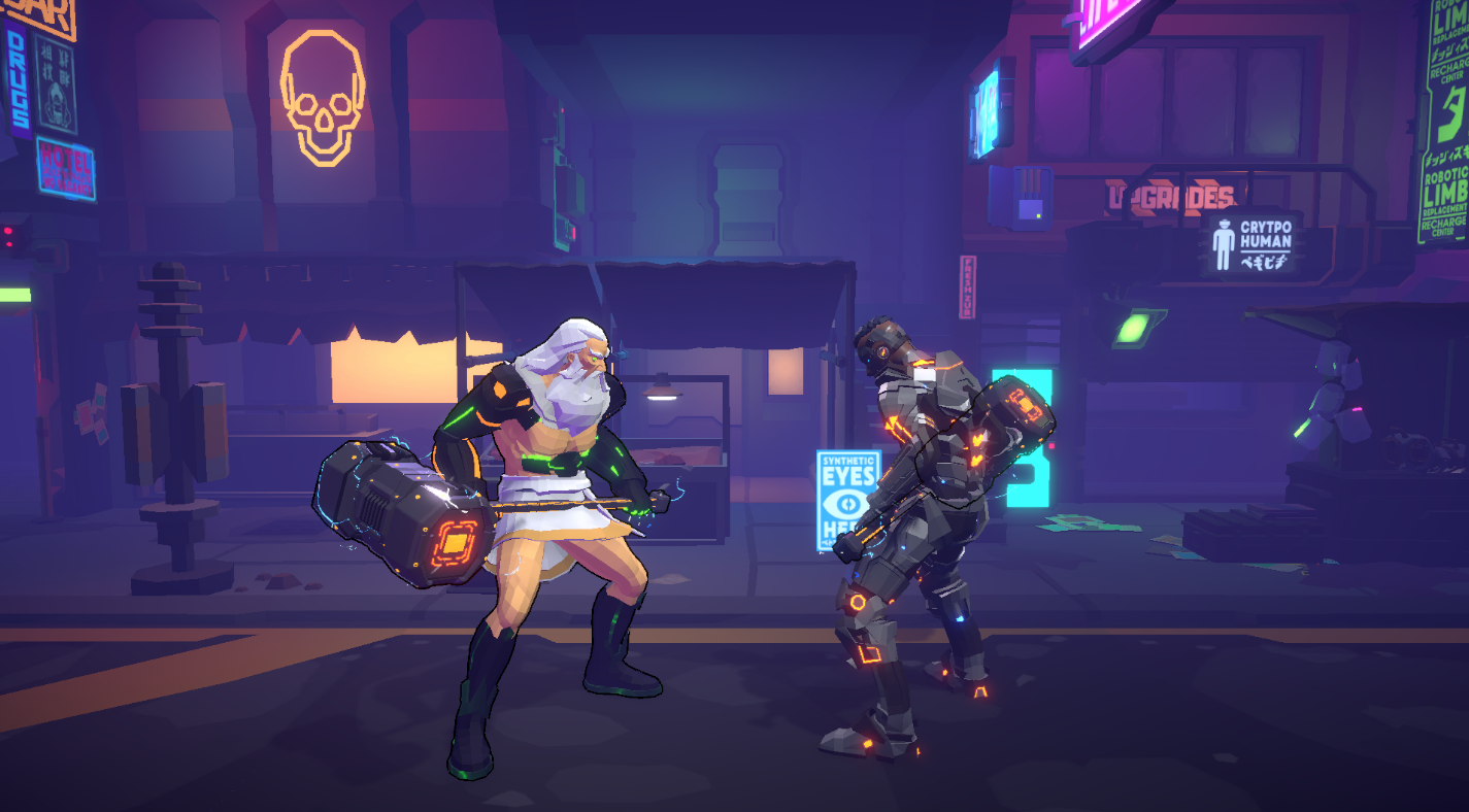
The character and weapon outline serves to make the characters stand out from the background, making it easier to tell where your weapon is. This makes for a gentler learning curve and easier combo chaining.
UI for PvP
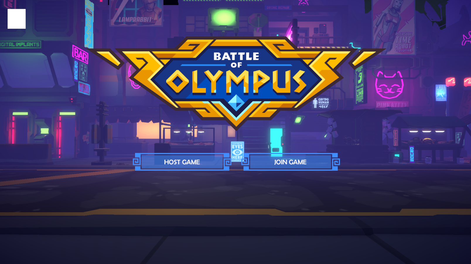
It’s almost ready. The UI is only the tip of the iceberg for PvP but we are still ironing out some kinks so look for an in-depth PvP update in the next Dev Diary in 2 weeks.
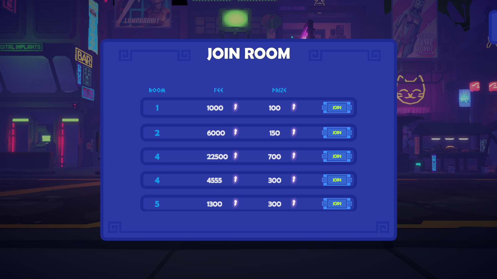
As for us, every time we look at these we get a little jolt of excitement. We can’t wait to play the game with you and test all the new additions with the community!
Coming up next…
Who knows what bugs and fixes will come up in the meantime? However, here is a loose promise. Next Dev Diary will bring:
- Fire effect
- Improved hit timings
- PvP speed test (remove lag)
- Issue with PvP lagging on Alt+Tab
- Special & super moves implementation
- & more!
Until then,
See you in Olympus!


